
the challenge
There’s nothing we love more than a good rebranding project and we were very excited when Venta got in touch and said they wanted a complete overhaul of their company branding; new logo, new tone of voice, new colour palette, new imagery style, the full shebang!
the challenge
There’s nothing we love more than a good rebranding project and we were very excited when Venta got in touch and said they wanted a complete overhaul of their company branding; new logo, new tone of voice, new colour palette, new imagery style, the full shebang!
initial design concepts
As the existing Venta branding had been in place for quite some time we felt it was important to create a more contemporary look that better reflected Venta as a company and their ambitions for the future.
initial design concepts
As the existing Venta branding had been in place for quite some time we felt it was important to create a more contemporary look that better reflected Venta as a company and their ambitions for the future.
lighting the way
A refined version of the current logo, accompanied with more dynamic imagery, always showing the lights in use. The light to dark gradient represents Venta’s vision into the future.
lighting the way
A refined version of the current logo, accompanied with more dynamic imagery, always showing the lights in use. The light to dark gradient represents Venta’s vision into the future.
lighting the way
A refined version of the current logo, accompanied with more dynamic imagery, always showing the lights in use. The light to dark gradient represents Venta’s vision into the future.
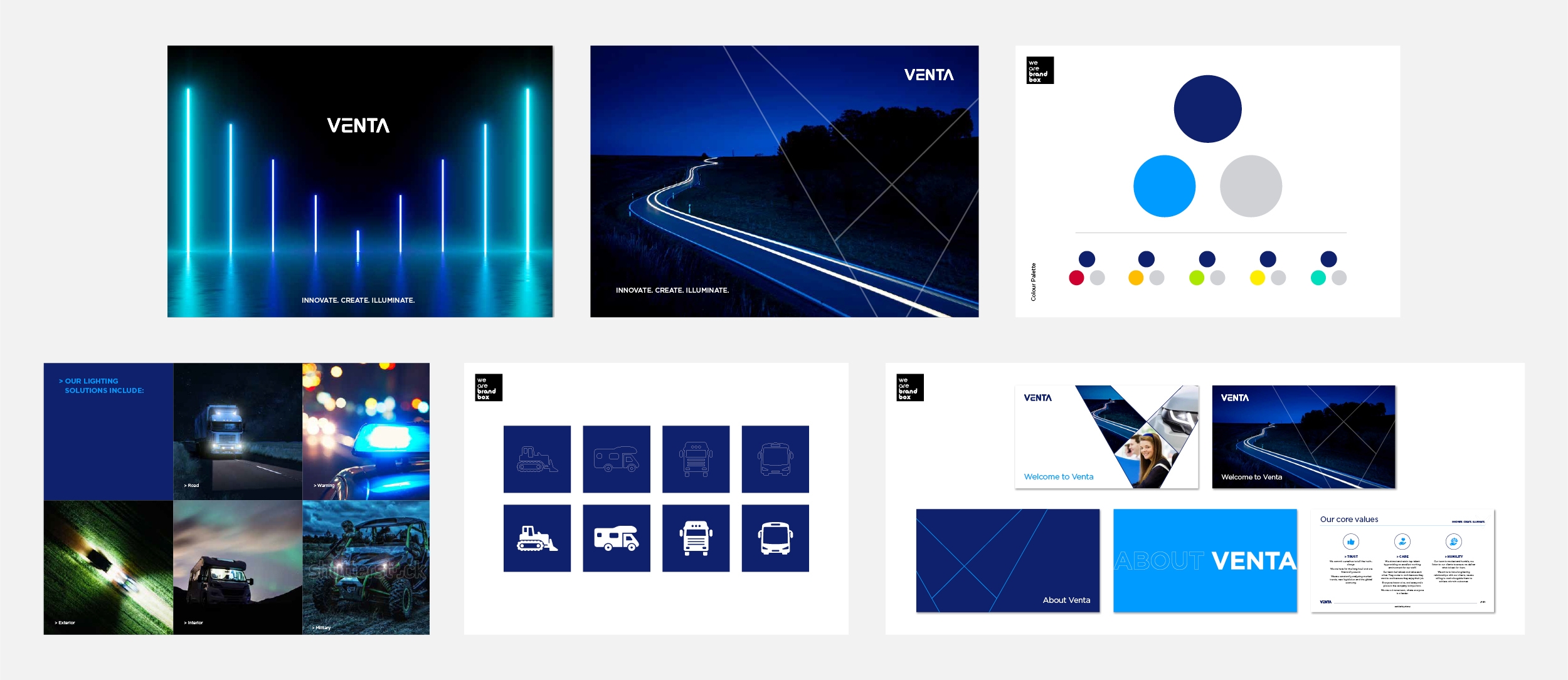
light beams
The V in the logo is created from two converging beams of light, the first represents Venta and the second the customer, the overlap in the middle represents the partnership. The modern styling and iridescent palette combine to create a contemporary look.
light beams
The V in the logo is created from two converging beams of light, the first represents Venta and the second the customer, the overlap in the middle represents the partnership. The modern styling and iridescent palette combine to create a contemporary look.
light beams
The V in the logo is created from two converging beams of light, the first represents Venta and the second the customer, the overlap in the middle represents the partnership. The modern styling and iridescent palette combine to create a contemporary look.
bright lights
The bright orange palette represents the largest leap possible from the preceding Venta blue and maximises contrast with the dark imagery.
bright lights
The bright orange palette represents the largest leap possible from the preceding Venta blue and maximises contrast with the dark imagery.
bright lights
The bright orange palette represents the largest leap possible from the preceding Venta blue and maximises contrast with the dark imagery.
the future is now
A wireframe evolution of the light beam graphic in the logo creates a more futuristic style. This is backed up with the abstract geometric backgrounds, image selection and typeface.
the future is now
A wireframe evolution of the light beam graphic in the logo creates a more futuristic style. This is backed up with the abstract geometric backgrounds, image selection and typeface.
the future is now
A wireframe evolution of the light beam graphic in the logo creates a more futuristic style. This is backed up with the abstract geometric backgrounds, image selection and typeface.
design development
After much deliberation it was decided that concept two was the overall winner although the colours proved to be a step too far. It was decided that we should explore the use of the light beam graphic and overall styling in shades of blue to forge a closer link to the existing branding.
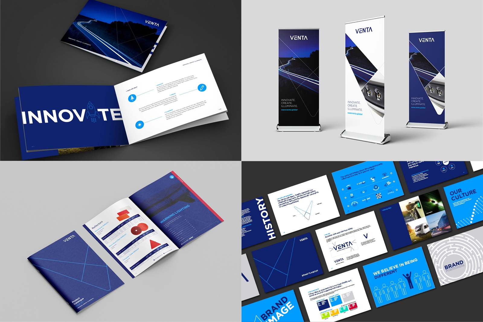
brand launch
As the previous branding had been left untouched for so long they wanted to go all out on the brand launch and we created a 72 page Brand Playbook which not only contained the creative do’s and dont’s of the new brand guidelines but also an in-depth overview of the company’s history, values, culture and views for the future. On the day of the official brand launch a copy was given to each of the employees.
another happy customer
“BrandBox has done a fantastic job in creating the new look Venta. We’re all still buzzing! We have a great partnership and BrandBox has become an extension of the Venta marketing team. The team at BrandBox is so creative, so quick and so friendly. It’s always a pleasure to work with them. I trust them with any of our requirements to turn things around quickly, brilliantly and for a good price!”
Philippa – Venta Global
TEAMWORK WORKS. SO LET’S DO THIS. TOGETHER.
TEAMWORK WORKS. SO LET’S DO THIS. TOGETHER.